Thanks-Boss
Role
UI/UX Design
Duration
January 2025- March 2025
Tools
Figma, Figjam, Procreate

My Contributions

1. Refined color palette

3. Created user flows and designed functions

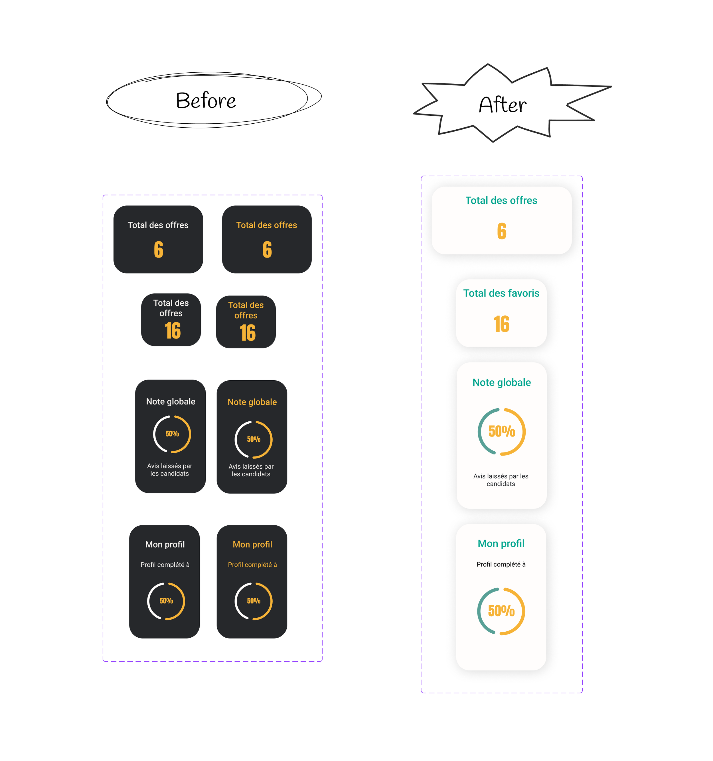
2. Refined and redesigned pages
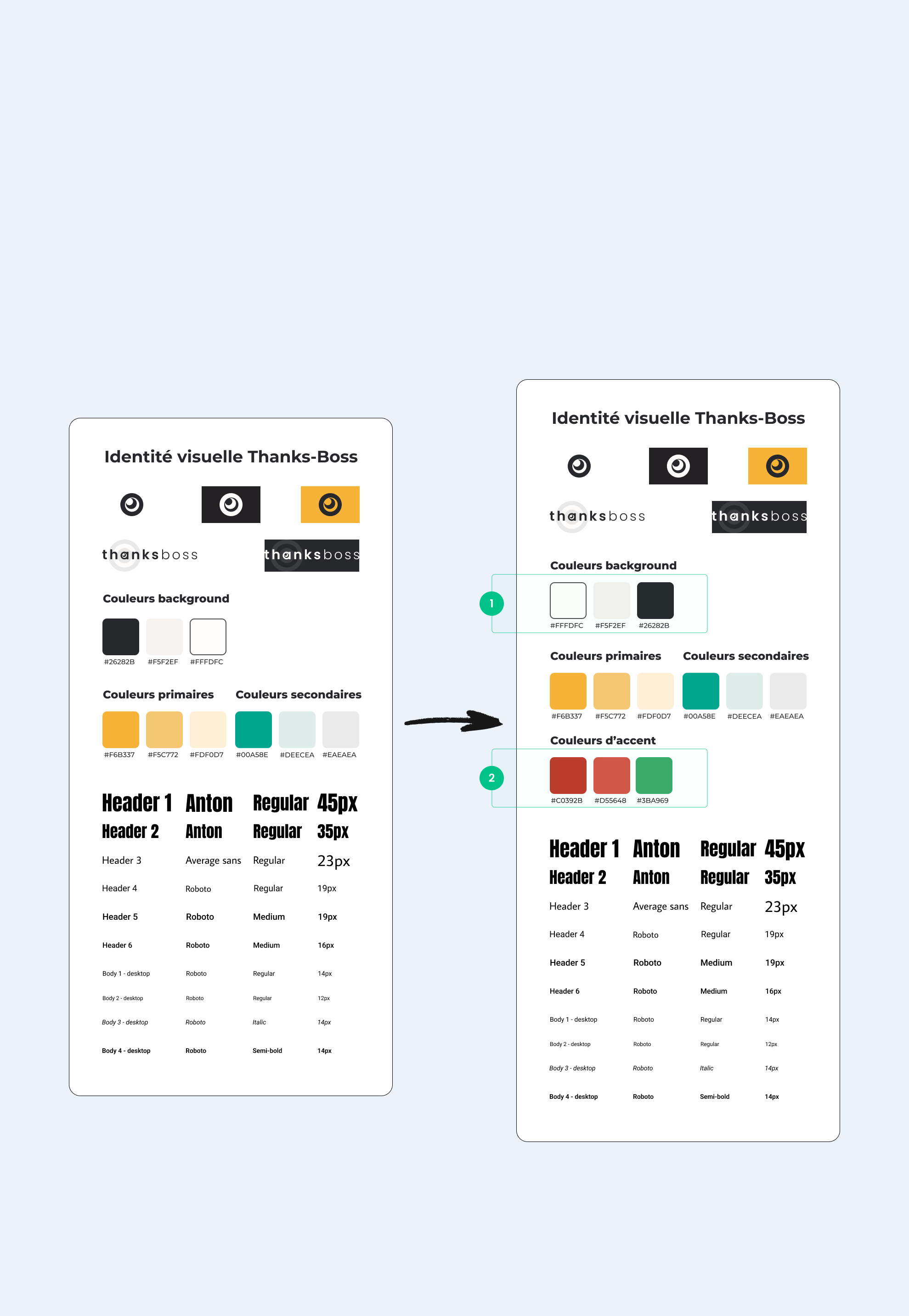
1.color palette refinement
I reviewed the existing color palette and found it generally solid, so I decided to keep the primary and secondary colors as they were. I made a few refinements for clarity and usability:
Reordered the usage of background colors: the previous palette relied heavily on black, so I retained black in the palette but reduced its usage to allow more balance and hierarchy.
Added two accent colors – red for alerts and green for completed/done actions – to provide clear visual cues.
These adjustments help make the interface more intuitive and visually coherent while maintaining the brand’s original identity
Before & After
Color System Transformation
The previous design used a black background with white and yellow elements, which felt visually heavy.
I introduced an off-white background to make the interface lighter and more modern while keeping yellow as the primary color and green as the secondary accent.
The examples show how these color updates were applied across the design system components.
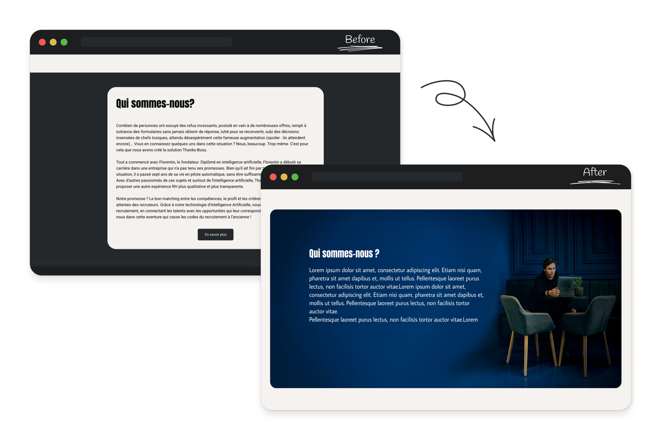
Redesigned multiple pages, like this one, to remove black backgrounds and create a lighter, more modern visual identity. I was also asked to simplify the “Actualités” page and give it a clean, newspaper-style layout.

Although I removed black backgrounds throughout the project to create a lighter and more modern look, I used dark sections like this one to add contrast and depth. For example, I extended the photo by illustrating the rest of the block in Procreate, blending it seamlessly with the design.